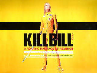
The poster is simple yet effective, due to the bright colours, bold titles, and the very symmetrical theme to the poster, for example, the streamlined titles and information text, and the single stripe across the middle and Uma Thurman standing directly in the middle of the poster.
Tuesday, 4 October 2011
Kill Bill Poster Analysis
This poster is for Kill Bill – a film that I have taken a lot of inspiration from to create my teaser trailer. The poster is comprised of a bright yellow background with the contrasting black text and embellishments to stand out. There are all sorts of connotations and metaphors that can be made to the yellow colour. For example, caution, intelligence and warning. Yellow is the colour of lemons, and this connotation can even be used as lemons are bitter; reflecting the mood of main protagonist, Beatrix Kiddo. The sub text ‘A roaring rampage of revenge’ is very dramatic, and the text colour is red, which has connotations with anger, evil, aggression, blood and death. All factors which are featured in this film – it gives a lot away about what might relate to this film. In red is also ‘Volume 1’ which draws attention to this text and implies that this is the first of a series or the first instalment to this particular story. ‘The Bride’ is wearing a yellow jumpsuit with black trim, again, another use of the yellow and black colour theme to make her costume match the poster (or the poster matches her costume). The jumpsuit is designed like leathers for a motorbike – giving the character a rebellious and fearless look of nature to her. This is then hit home by the expression of boldness and strength on her face. She looks determined and powerful. She is also holding a samurai sword; which gives away an element of the plot and is a device to give the audience a little more information about the film. The character looks very practically dressed and like she has a motive and a drive. This audience can get a lot of information from this simple poster. With the title ‘Kill Bill’ layered on top of the characters image, it leaves the audience to interpret that perhaps the character is set out to kill ‘Bill’. Having the picture of the star on the poster, Uma Thurman, on the poster may also draw in a wider audience, and with the text ‘The fourth film by Quentin Tarantino’ in a noticeable black colour with the white contrast – this grabs an audience’s attention and remind them that Tarantino will probably use his trademark cast choices.
Subscribe to:
Post Comments (Atom)
No comments:
Post a Comment